Cinematic Grading: Elevate Your Visual Storytelling with Pro Color Techniques
The skill of cinematic color grading makes a standard video turn into a movie in the modern world of filmmaking.
Cinematic color grading is a complex process aimed at the color correction of a video in a way that serves a particular purpose, marks a specific scene, and provides an appealing visual experience. The choice of a color scheme in a particular setting or a movie is crucial for setting the mood of the whole work. Along with this color grading cinematic, hyper-reality is added to the cinematic experience, which allows it to take the viewer to other locations, past dates, or emotional states.
Let's explore the intricacies of this cinematic colour grading and how it impacts the plots and visual aesthetic appeal of a few remakes.
Part 1. Understanding Cinematic Grading
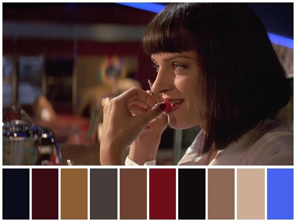
Cinematic grading, often called color grading cinema or color correction, is the process of carefully adjusting the colors in a film to produce the intended mood, tone, or aesthetic.
Enhancing a film's visual narrative is the primary goal of color grading cinematic look. It enables filmmakers to craft a unified and expressive visual language, directing viewers through the story through color manipulation to evoke particular feelings, moods, and settings.
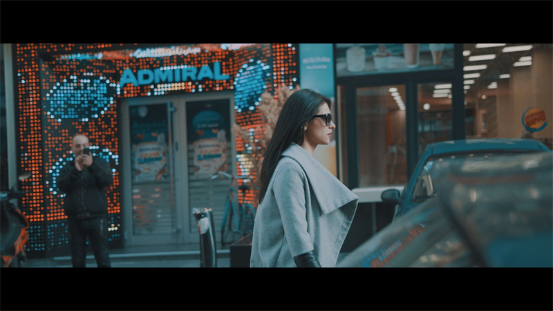
Cinematic grading ensures that the film's visual unity is kept intact, mainly when the scenes are shot in different locations or using other lighting conditions. It brings all components of the visible part together, resulting in a color grading for cinematic look and feel.
For vast cinematic video color grading enables filmmakers to refine the visual character of their work as well as do cinematic color correction. It allows them to add their own distinct visual style that makes their movies visually unique.
A film’s general mood is created through color grading, thus determining how the viewers perceive and engage with the story arcs. Cooler hues signify some tension or suspense, while warm hues may bring about warmth or nostalgia.
Filmmakers creatively use color to induce specific emotions in their audiences through cinematic photo color grading. On the other hand, cool tones like blue and green generate an ambiance of calmness or sadness, while warm colors such as red and yellow highly stimulate or excite.
Color grading can be subtly used to draw the audience's attention toward essential characters or plot points through well-focused single frames. This delicate touch makes the viewer see the story in a particular way.
The essence of cinematic look color grading is the capacity to produce a visual symphony that stays with viewers long after the credits have rolled.
Part 2. Practical Use of Color Grading in Movies
Beyond simple aesthetics, color grading in films is an art form that greatly enhances visual immersion and storytelling. Let's see how this metamorphosis process improves a few classic movies' story and graphic elements.
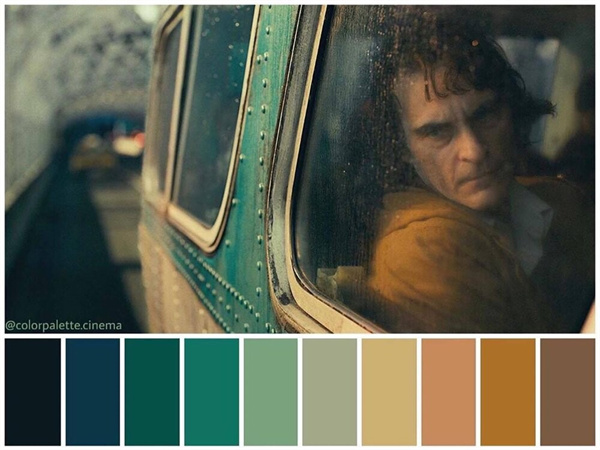
1. Saving Private Ryan (1998)
"Saving Private Ryan," a military epic directed by Steven Spielberg, uses a desaturated color scheme to depict the brutality of World military II.
The subdued colors increase the movie's emotional effect, which creates a grim and gritty mood. The desaturation strengthens the audience's bond with the characters, which delicately emphasizes the loss and sacrifice that come with conflict.
2. The Grand Budapest Hotel(2014)
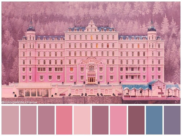
"The Grand Budapest Hotel," a visually gorgeous masterwork by Wes Anderson, is a kaleidoscope of pastel and vivid hues.
The thoughtful use of color complements the fanciful story, resulting in a visually striking and unforgettable universe. Every color choice is deliberate to accentuate the quirkiness and allure of the characters and the setting.
3. Skyfall (2015)
"Cinematographer Roger Deakins brings visual brilliance to 'Skyfall,' the James Bond film released in 2015."
The color grading in "Skyfall" is the artist's tool that develops the visual appeal of the spy thriller. The film's vivid, gloomy colors add the intensity and emotions of James Bond's world, but the story becomes more meaningful.
4. Blade Runner 2049 (2017)
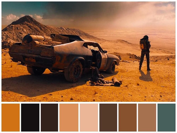
The cinematic grading is one of the vital components of "Blade Runner 2049," Denis Villeneuve's sci-fi conquest that will take the spectators to the dystopian future.
The movie's application of contrasting colors and bright neon lights accentuates the future-oriented setting. AI vs. humanity is being presented through the color scheme, which is now a part of the narrative.
Part 3. Pro-tip: How To Enhance Colors of Videos to Achieve Cinematic Color
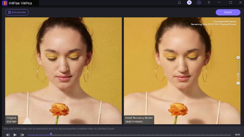
HitPaw VikPea (formerly HitPaw Video Enhancer) has a sturdy and flexible nature that makes it possible to push your videos to the best color grading for cinematic look. In its intuitive interface and wide comprehensiveness, it's the first choice for filmmakers and content producers seeking to enhance the color grading of their works.
The new Color Enhancement feature is the most significant breakthrough in HitPaw VikPea for filmmakers. It provides a user with an array of options to give the exact mood they desire by closely adjusting and bolstering colors.
HitPaw VikPea offers a convenient and best cinematic color grading process and works well with other programs. The user-friendly design makes this possible possible, allowing novice and expert users to use the program quickly.
Features- HitPaw VikPea is an AI-driven solution, not merely a color improvement tool. The sophisticated algorithms examine your video, considering the subtleties in every shot, and then apply adjustments for the best possible visual effect.
- One of HitPaw VikPea's unique features is its ability to upsample videos to 8K quality. It future-proofs by ensuring that your material satisfies the constantly changing visual quality requirements.
- HitPaw VikPea is an easy-to-use interface that makes navigating around it effortlessly. The intuitive layout guarantees that adding effects to your films is a simple and pleasurable experience.
- HitPaw VikPea knows how critical it is to preview your work without interruptions. Use a watermark-free preview so you can clearly evaluate the outcomes before completing your improvements.
Step 1:To obtain the authentic HitPaw VikPea bundle, click the download button.
Step 2:After installing it, you must now import the video that you want the software to AI upscale. You have two options: drag and drop the original video to it or select it by clicking on it.
HitPaw VikPea is compatible with over 30 input formats, including the most often-used ones, such as MP4, AVI, MOV, MKV, and M4V.
Step 3:The seven AI models available to you in this video quality enhancer are the General Denoise Model, Animation Model, Face Model, Colorize Model, Color Enhancement Model, Frame Interpolation Model, and Stabilize Model.
(Note: Click the "Add Model" button to download the models from the Model Library if they are not completely visible on the main interface.)
Step 4:To review the video once it has been uploaded, click Preview. Thus, you may need to wait for a few seconds. When satisfied with the edited video clip, click the Export option to save it.

Note: The Liberated video cannot be exported with the free version.
Part 4. FAQs of Cinematic Color Grading
Q1. What is the best color grade for cinematic video?
A1. The color grading in cinema videos varies depending on the intended mood, storyline, and desired atmosphere. The HitPaw VikPea is the best tool for engaging videos of any category.
Q2. What is videographer color grading?
A2.
Coloring is a process by which a professional videographer specializing in taking and editing video footage controls the tint of the recorded material during post-production.
This process is required to achieve a specific visually appealing aesthetic, eliminate color imbalance, and make the video attractive to the viewer. Videographers use color grading techniques to determine the optical correctness, set the mood, and amplify the effect of their work.
Q3. What are the best settings for cinematic?
A3. A director utilizes a blend of filming techniques, lighting, and camera settings to achieve a cinematic effect. However, the "best" settings will depend on the demands or specificity of a project.
Final Thoughts
In the cinematic world, color is the most effective means of communication. Color grading is a brushstroke that makes the narrative cine-canvas emotional.
Before you start the cinematic adventure, think about the color impact, explore the HitPaw VikPea subtleties, and finally, become aware of the full potential of your visual story as you make your move.
Enhance your films, enthrall viewers, and let them experience the wonders of cinematic color grading. It is crucial for your tale to be conveyed in colors that make the audience feel something when they see it.



 HitPaw Edimakor
 HitPaw Univd (Video Converter)
  HitPaw VikPea (Video Enhancer)

Share this article:
Select the product rating:
Daniel Walker
Editor-in-Chief
My passion lies in bridging the gap between cutting-edge technology and everyday creativity. With years of hands-on experience, I create content that not only informs but inspires our audience to embrace digital tools confidently.
View all ArticlesLeave a Comment
Create your review for HitPaw articles