Explore Best Resolution Website Background Image for Enhanced User Experience
Choosing the right website background image resolution is crucial for ensuring both high-quality visuals and fast loading times. The best resolution for website background image depends on various factors like screen size, aspect ratio, and design requirements.
By selecting the optimal resolution, you can improve the user experience, creating a visually stunning website while maintaining efficient performance. In this article, we'll explore the best resolution for website background image to help you make informed decisions.

Part 1. Best Image Resolution for Website Background
Website background image resolution refers to the quality and clarity of an image displayed as the background of a website. It is typically measured in pixels (width x height) and plays a significant role in the visual appeal and performance of a website.
A high-resolution background image can make the site look professional, while a poorly chosen resolution can result in blurry or pixelated visuals. The right resolution ensures that the image looks sharp across different devices without slowing down page load times.
1.1 What Affects Resolution for Website Background?
Several factors influence the choice of best resolution for website background image:
- Screen Size & Device Type: The resolution must adapt to different devices, from mobile phones to desktop monitors. A background image must look good across varying screen sizes.
- Aspect Ratio: The aspect ratio (the width to height ratio) of the image should match the design layout to avoid distortion.
- Image Compression: Images need to be compressed effectively to balance quality and file size, preventing slow load times.
- Retina Display: For devices with high-resolution screens, such as Retina displays, a higher resolution image may be required to maintain sharpness.
- Design Aesthetic: The resolution is also influenced by the desired aesthetic and design of the website. Background images should complement the layout and not distract from content.
1.2 Recommended Resolutions for Website
Here are the recommended resolutions for website background images based on screen size and device:
Mobile Devices (Portrait Mode):
- Minimum: 1080 x 1920 px
- Recommended: 1440 x 2560 px
- For mobile-friendly backgrounds, ensure the image is optimized for smaller screens to avoid excessive data usage and slow load times.
Tablets (Portrait Mode):
- Minimum: 1200 x 1600 px
- Recommended: 1600 x 2560 px
- Tablets usually have mid-range resolutions, so the background should be slightly larger to ensure clarity without sacrificing performance.
Small Desktop Screens (1366px width):
- Minimum: 1366 x 768 px
- Recommended: 1920 x 1080 px
- Ensure images look clear on HD screens without compromising performance.
Large Desktop Screens (1920px width or more):
- Minimum: 1920 x 1080 px
- Recommended: 2560 x 1440 px
- Large desktop screens demand higher resolution images to look sharp, but avoid excessive image size to ensure fast loading.
By selecting the right website background image resolution for each device type and screen size, you can create a visually appealing website without sacrificing speed or user experience.
Part 2. Tips for Best Background Image Resolution for Website
2.1 How to Measure the Image Resolution
To ensure that your background image has the best quality, it's essential to measure and assess the image resolution for website background. There are several ways to check and measure image resolution for website background effectively:
- Pixel Dimensions:
- DPI (Dots Per Inch):
The image resolution for website background is often given as pixel dimensions (width x height). For example, an image with a resolution of 1920 x 1080 px has a width of 1920 pixels and a height of 1080 pixels. Larger dimensions typically indicate better resolution.
While DPI is more relevant for print, for web design, it should generally be set to 72-96 DPI. This ensures the image will display well on screens without being too large for web use.
Tools to Measure Website Image Resolution:
Adobe Photoshop:
- Open the image in Photoshop and go to Image > Image Size. You'll see the pixel dimensions and DPI of the image.
GIMP (Free Alternative to Photoshop):
- Open the image, and go to Image > Scale Image. This will show you the current pixel dimensions and DPI.
Online Image Resizers & Checkers:
- Websites like TinyPNG, ImageOptim, and JPEG-Optimizer let you upload an image and view its resolution, then resize or compress the image accordingly.
Browser Developer Tools:
- Right-click on an image in your browser and choose Inspect (in Chrome or Firefox). Under the Network tab, you can see the image's file size and resolution (in pixel dimensions).
2.2 How to Ensure the Suitable Image Resolution for Website
Selecting the optimal background image resolution for website involves balancing high-quality visuals with fast loading times. Here are a few tips to achieve the right balance:
1. Choose the Right File Format:
The file format can affect both image quality and file size. Common formats include:
- JPEG: Best for photos and detailed images. It offers a good balance of quality and file size.
- PNG: Best for images with transparency or simple graphics. It offers higher quality but can have larger file sizes.
- WebP: This format offers excellent quality and much smaller file sizes than JPEG or PNG, making it ideal for web use.
- SVG: Best for logos and vector images, as they scale infinitely without losing quality.
2. Image Compression:
Compressing your images reduces their file size without significantly affecting quality. Use compression tools to optimize the image:
- TinyPNG or JPEG-Optimizer for automatic compression.
- ImageOptim for Mac users, which provides efficient image compression.
3. Responsive Images:
Implement responsive image techniques using HTML attributes like srcset. This allows browsers to select the appropriate resolution based on the device's screen size and resolution, improving loading times and reducing unnecessary bandwidth usage.
Example of using srcset:
<img src="image.jpg" srcset="image-small.jpg 500w, image-medium.jpg 1000w, image-large.jpg 2000w" alt="Website Background">
4. Limit Background Image Size:
When choosing a background image resolution for website, remember that you don't need ultra-high resolution images for background use, especially on larger screens. Focus on optimizing for the most common screen sizes while keeping the file size manageable.
5. Use CSS for Background Size Control:
By using CSS properties like background-size: cover and background-position: center, you can control how the background image fits different screen sizes and aspect ratios. This helps avoid the need for overly large background images.
6. Test Load Time:
Use tools like Google PageSpeed Insights, GTmetrix, or Pingdom to test your website's loading speed. These tools will help you identify if large resolution for website background images are slowing down your site and provide optimization suggestions.
7. Optimize for Retina Displays:
For devices with high-resolution screens (like Retina displays), provide images at 2x or 3x the standard resolution. This ensures that images remain crisp on screens that display at higher pixel densities.
8. Keep a Consistent Aspect Ratio:
Ensure that your background image maintains the right aspect ratio for various screen sizes. Avoid stretching or distorting the image by using CSS properties like background-size: cover to automatically adjust the image to fit the screen.
Part 3. Bonus Tips to Enhance Website Background Quality
HitPaw FotorPea is an advanced online tool that allows you to enhance the resolution and quality of your background images. It uses AI technology to improve the clarity and vibrancy of your images while ensuring they are optimized for the web.
This tool is especially useful for improving the sharpness of images, adjusting brightness and contrast, and making minor corrections to help your background images look more professional.
Key features of hitpaw fotorpea
HitPaw FotorPea - All-in-one Photo Editing Tool for Win & Mac
Secure Verified. 212,820 people have downloaded it.
- AI-Powered Enhancements: Automatically improve sharpness, contrast, and brightness for clearer, more vibrant images.
- Image Resolution Adjustment: Increase image resolution to improve clarity, ideal for high-DPI displays.
- Color Adjustment: Fine-tune the color balance, saturation, and contrast for enhanced visual appeal.
- Lossless Compression: Reduce file size without compromising image quality, ideal for fast-loading websites.
- Multiple File Formats: Supports JPEG, PNG, WebP, and other formats for flexible optimization.
Secure Verified. 212,820 people have downloaded it.
Steps to enhance image quality
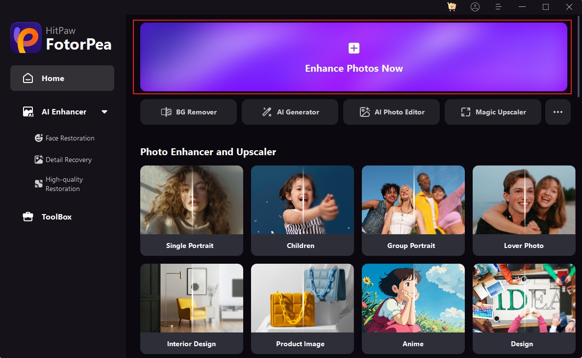
1. Visit HitPaw FotorPea:Open the website HitPaw FotorPea on your browser.
2. Upload Image:Click on the "Upload Image" button and select the image you want to enhance from your device.

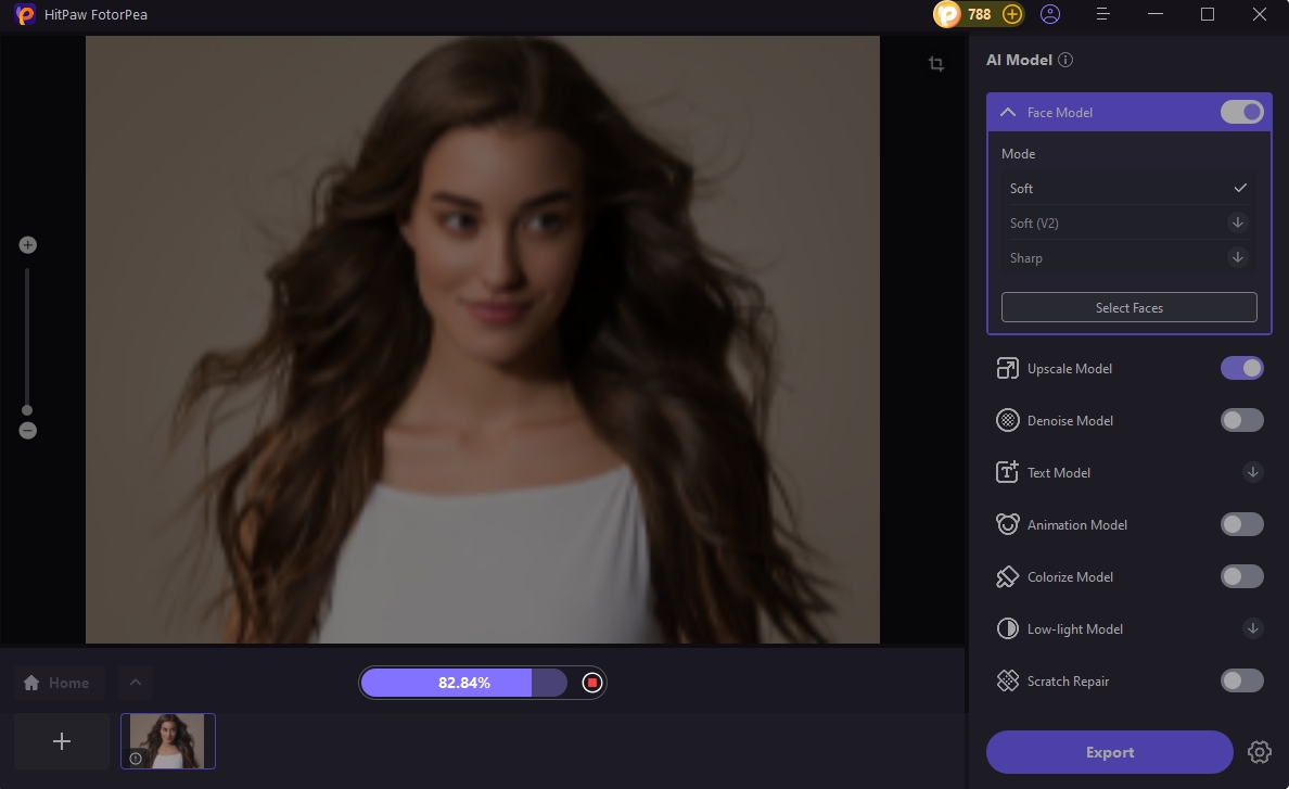
3. Apply Enhancements:Use the AI-powered tools to improve the sharpness, brightness, contrast, and adjust the image resolution as needed.

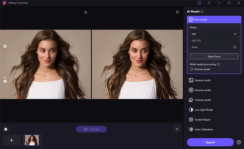
4. Preview Changes:Review the preview of the enhanced image to ensure it meets your visual preferences.

5. Export Image:Once you're satisfied with the results, click "Download" to save the optimized image to your device for use on your website.
Conclusion
To ensure optimal quality and performance, choosing the right website background image resolution is crucial. Focus on the right file size and resolution for various devices, balancing image quality and load speed.
Tools like HitPaw FotorPea can help enhance image clarity, sharpness, and resolution without losing quality. By compressing images and applying AI-powered enhancements, HitPaw FotorPea optimizes your website background images for a faster, visually appealing experience.




 HitPaw Univd (Video Converter)
 HitPaw VoicePea
  HitPaw VikPea (Video Enhancer)


Share this article:
Select the product rating:
Daniel Walker
Editor-in-Chief
This post was written by Editor Daniel Walker whose passion lies in bridging the gap between cutting-edge technology and everyday creativity. The content he created inspires the audience to embrace digital tools confidently.
View all ArticlesLeave a Comment
Create your review for HitPaw articles