Muted Colors – A Complete Guide to The Meaning and Uses
Part 1. What Are Muted Colors?
Muted colors are tones that have been softened, desaturated, or grayed down to reduce their intensity. Unlike bright or neon colors, muted colors have a more subdued and natural appearance. They often evoke a sense of calm, sophistication, and timelessness.
For example, a muted version of a bright red might become a dusty rose, while a vibrant blue could transform into a soft, grayish-blue. One popular muted color is cream (hex code: #FFFDD0), a warm, neutral tone that pairs beautifully with other muted shades.

Muted colors are versatile and can be used in a variety of contexts, from interior design to fashion and digital art. Their understated nature makes them ideal for creating harmonious and balanced compositions.
How Are Muted Colors Created?
Muted colors are created by:
- Mixing a color with gray – Reducing vibrancy without making it darker or lighter.
- Adding black – Creating a deeper, less saturated version of the original color.
- Adding white – Making a softer pastel shade while reducing intensity.
For example, bright red (#FF0000) can be turned into muted brick red (#A52A2A) by adding gray or black.
Part 2. Muted Colors in Design and Fashion
Muted colors are everywhere, from stylish home decor to trendy outfits. Their subtle, understated nature makes them incredibly versatile.
1. Muted Colors in Interior Design
Muted colors are a staple in modern and minimalist interior design. Shades like soft beige, sage green, dusty blue, and warm gray create cozy and stylish spaces.
Why designers love muted colors for interiors:
- They provide a calming atmosphere.
- They complement natural materials like wood and stone.
- Make rooms feel bigger and brighter.
- Offer a soothing atmosphere for relaxation.
- Provide a neutral base for accent colors.
2. Muted Colors in Fashion
Muted tones dominate the fashion industry, from everyday wear to high-end couture. Earthy tones, soft pastels, and neutral shades are versatile, making them a favorite for creating timeless and effortless outfits.
Muted color trends in fashion:
- Dusty Rose (#D4A5A5) – A romantic, vintage-inspired pink.
- Olive Green (#808000) – Earthy and neutral, perfect for autumn.
- Warm Taupe (#AF9483) – A stylish, modern beige-brown.
- Muted Navy (#3F5277) – A deep blue with a subdued effect.
These colors are often seen in seasonal wardrobes, particularly in autumn and winter collections, due to their warm and subdued appeal. Muted tones are easy to mix and match, making them perfect for capsule wardrobes. They are also popular in wedding dresses, business attire, and luxury fashion for their refined appeal.
3. Inspiring Muted Color Palettes
Muted color palettes work well for branding, graphic design, and art. They add depth and sophistication to any visual composition.
Examples of beautiful muted color palettes:
- Earthy Tones: Warm taupe, olive green, and sandy beige
- Pastel Dreams: Dusty pink, baby blue, and light lavender
- Neutral Elegance: Soft gray, muted gold, and deep navy
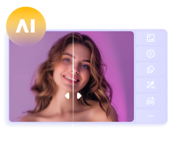
Part 3. The Best Tool to Customize Muted Color Images with HitPaw FotorPea
If you’re looking to incorporate muted colors into your designs or images, HitPaw FotorPea is an excellent tool to help you achieve your vision. This user-friendly platform allows you to customize images with ease, making it perfect for both beginners and professionals.
Why Choose HitPaw FotorPea?
- AI-Powered Image Editing – Automatically adjust saturation and brightness.
- One-Click Color Enhancement – Perfectly refine muted tones for a natural look.
- Customizable Settings – Fine-tune hue, contrast, and color temperature.
- User-Friendly Interface – Edit photos easily, even if you're a beginner.
- Filters - Apply pre-designed filters to achieve a cohesive muted look.
- No image quality loss was detected when generating the muted colors images.
Steps to Generate Muted Color Images
Step 1. Upload Your Image: Start by uploading your image to HitPaw FotorPea.


Step 2. Type in the text description of what you want to generate and then you'll need to select the image style and resolution. Choose the appropriate style and have the option to generate multiple images.
Step 3. Press on the Generate button to create the muted colors images and this process won't take any extra time generating the images.
Part 4. FAQs About Muted Colors
Q1. What is the difference between muted and soft colors?
A1. While both muted and soft colors are subtle, muted colors are created by adding gray or black to a hue, reducing its intensity. Soft colors, on the other hand, are typically lighter and pastel-like, achieved by adding white to a color.
Q2. What is the psychology of muted colors?
A2. Muted colors often evoke feelings of calmness, sophistication, and subtlety. They are widely used in branding, interior design, and fashion to create a professional and soothing aesthetic.
Final Words
Muted colors bring a unique and elegant charm to design, fashion, and everyday visuals. Their understated appeal makes them timeless and versatile for any creative project.
To make the most of muted colors in your projects, we recommend using HitPaw FotorPea. Its intuitive tools and features make it easy to customize images and create stunning visuals with muted tones. Try it today and unlock the beauty of muted colors in your work!
 HitPaw Edimakor
 HitPaw VikPea (Video Enhancer)
 HitPaw Univd (Video Converter)

Share this article:
Select the product rating:
Daniel Walker
Editor-in-Chief
My passion lies in bridging the gap between cutting-edge technology and everyday creativity. With years of hands-on experience, I create content that not only informs but inspires our audience to embrace digital tools confidently.
View all ArticlesLeave a Comment
Create your review for HitPaw articles